Posters:

Inception: This thriller film poster creates suspense, as you can't tell what the film is about by the poster however there are hints to it being a thriller as the lighting in the poster suggests that it is mysterious and thrilling. it also suggests to it being an action as well as they are holding guns.

Jaws: This iconic movie poster and thriller film is mostly mistaken for a horror, however it is a thriller. The red text displaying "Jaws" points out blood gore and also danger. the poster excites the audience as they want to find out what happens next to the swimmer. In the poster the shark is comparatively bigger than the swimmer automatically showing who the antagonist is through the poster giving you an idea of the plot.
DVD covers:

Dark knight: this is distinctly a thriller just by looking at the cover. In the centre of the front cover stands batman and behind a building that has been imprinted with the batman symbol. overall the cover has really dark lighting suggesting it to be a film with a dark mood that creates suspense. The back cover shows Bruce Wayne which means that it is something extraordinary happening to an ordinary person as that is almost the definition of a thriller.
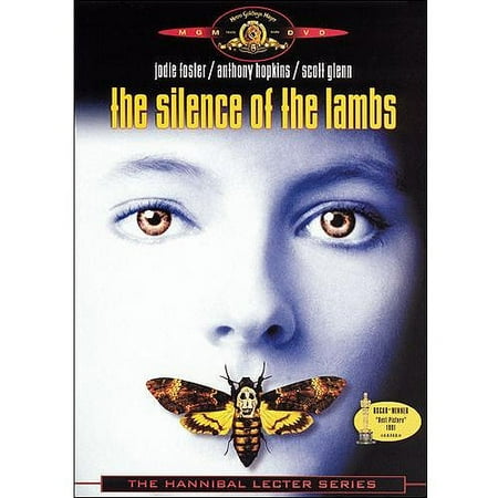 Silence of the lambs: this dvd cover is very simple and effective, the title font is quite scary, which might suggest that this is a thriller horror genre, there are very little words bar the title making more room for audience to see the background behind it and will create more suspense. in the centre of the cover there is a pale white face, this follows most of the thriller dvd cover themes of the colours only being black and white, this is done to create the mood and give an understanding of the film.
Overall thriller films DVD covers and posters are made to create suspense and drama before the audience watch the films, this gives me an understanding of when I create my DVD cover and poster to make the mood quite dark and feature the colours black and white primarily. also to make sure that the font I use stands out from the background.
No comments:
Post a Comment